Drum and Company is a band from South Florida whose ultimate goal is to help those who listen to them feel heard, understood, and valued. If you haven’t guessed already… it’s my brainchild, passion project, or whatever you’d like to call it. This project is my baby; every aspect of the visual identity for Drum and Company flowed through and was approved by me.
When it came to the look and feel of Drum and Company, I needed to make sense of what Drum and Company actually was. This meant I needed to challenge my assumptions and identify challenges I’d had before; eventually I realized that I’d never taken the time to construct the consumer I was trying to reach, so I did.
In the discovery process, I consulted a myriad of individuals who I respect in the areas of deign, photography, and brand building. I found that the consumers I want to reach are 20-35 years old who prioritize their mental well-being; people who value authenticity and transparency. These same individuals love bands like Young The Giant, Mumford and Sons, and Judah and the Lion.
Aesthetically, I wanted to keep type simple and timeless; I wanted to produce visuals that felt real, so a film-inspired look was imperative. I wanted the visuals and language to reflect the sense of authenticity that I strive for every day while still having fun. However, I still wanted to convey a sense of depth and cinematic quality.
What I wound up with was something that felt bold, fresh, and empowered. The final stylescape is shown below.

It was imperative that I get this right. Therefore, when it came to the most important identifier of the visual identity, I outsourced the logo design to Gabriel Murgueytio, a designer at Jones Knowles Ritchie. I did this to avoid taking forever and a day on this particular aspect of the project; if I could give a talented designer an already-established/approved direction on the look and feel, I’d have distinctive choices that were easy to approve. Ultimately, the goal was to establish a simple, aesthetically pleasing identifier for the brand.
In the end, this was the only draft I needed to see. It was simple and recognizable, scalable, and the composition is just beautiful. The letters ascend left to right, allowing for a pleasing mark to look at.

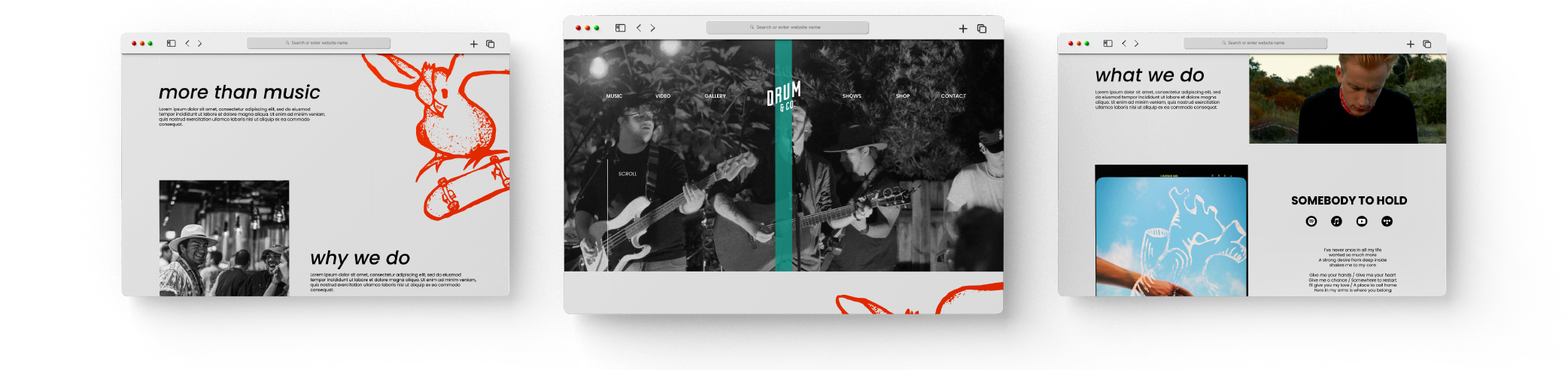
From here, I developed elements of the visual identity. This included colors, textures, type, and photography. I included all of this in the band’s brand identity guide, and from there I went to work on additional elements and extensions of the brand’s existence. This included illustrative work, t-shirt mockups, as well as mockups for album art, poster design, a photography treatment, and a web page. Additionally, I put together collateral such as business cards and invoice templates as well as a letterhead design (not pictured here).
After putting together the CI guide and all of the additional collateral, I went to work on the actual website, my first ever website design (which you can find here). If you'd like to see the final CI guide in its entirety, fill out the contact form below to let me know!